

Color is only as complex -
as you make it.
Black & White Coffee Roasters

At Black & White Coffee, the way we choose to use color is nothing short of purposeful.

The Year Rounds -
-
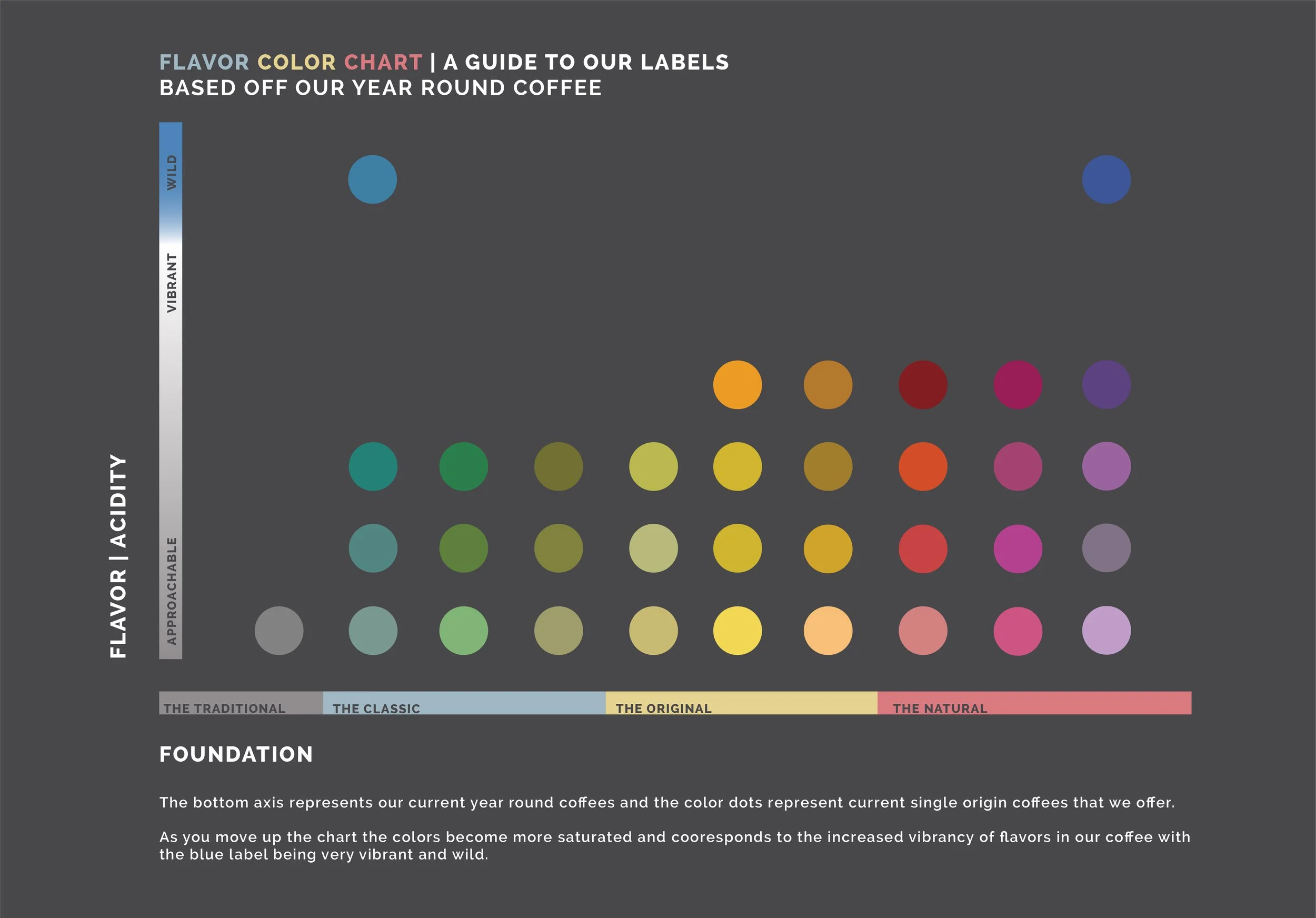
The Natural is the firstborn in the B&W coffee family, with its origins going all the way back to the first cafe that we opened. For many in the coffee industry, a natural process coffee was their first step into consuming specialty coffee. It is a great place to start if you want to explore more fruit-forward coffees. The Natural as a product will vary in its components throughout the year. This variation is how we embrace and celebrate the seasonal availability of naturally processed coffees.
In "The Natural" category you will see flavors such as red fruits like raspberries, cherries and various dark berries, chocolates, and acidity ranging from balanced to vibrant.
Other coffees that follow this coffee are those with red, pink, purple and even dark purple labels.
-
As the second coffee to come from B&W, this Year-Round focuses on the nostalgia and comfort that coffee can offer. The inspiration behind the Classic is the breakfast-style coffee that you grew up with. It is a coffee that can remind you of cozy memories, and it pairs excellently with cream and sugar.
In "The Classic" category you will see flavors such as caramelized sugars, subtle stone fruits, milk chocolate, and balanced acidity.
Labels that follow tasting similarities to this coffee are teal, green and olive green labels.
-
The Original is a tip of the hat to the origins of coffee, tracing back to Ethiopia. It is our expression of appreciation for cafe arabica. This Year-Round is a lighter roast than all the others, which compliment the delicacy of the coffee.
In "The Original" category you will see flavors such as delicate florals, citrus, balanced - light acidity, and a tea like body.
Other coffees that follow this one will have darker yellow labels and orange labels.
-
This Year-Round comes from a desire to feature coffees from light to dark roasts, to ensure that everyone can find a coffee to their liking. This coffee is the darkest roast that we offer at B&W. If you typically find yourself going for a dark roast coffee at the grocery store, we invite you to taste our expression of this familiar concept in The Traditional.
In "The Traditional" category you will see flavors such as delicate dark chocolate, deep cherries, and nutty sweet marzipan.
The Traditional came later in the Black & White Lineup.
The Foundation of Black & White’s Color Theory.
Each of the Year Round Coffees took on a color value of Print colors (CMYK). In the beginning the concept of this was more accidental as Black & White only had certain colored labels available. Kyle Ramage, Co-owner of Black & White knew he wanted, The Classic to have this comforting blue color and The Natural, being a natural processed coffee to have a pink label. From then the others fell in place to follow CMYK values.
When Black & White decided to launch a new lineup in the Year Round Coffees, called The Traditional, I proposed a silver or grey color to make up the missing “K” value of the “CMYK.”
The whole process has been year in the making, with Kyle at the lead of assigning different coffees a color that corresponded to their taste perception and the team adding in thoughts.




Concept - Direction
Black & White over the past year, has had so many questions on what the color of the labels mean.
Or is there any relationship between one color to the next?
This lead to creation of a pattern for the colors and a series of “foundation videos and images” to share the information.
Brand Visuals & Identity
Coffee So Approachable, It’s Mema Approved.
-
Creative Direction | Jenn Hall Sweatte
Editor | Dorian Wright
-
Creative Direction | Jenn Hall Sweatte
Editor | Dorian Wright
-
Creative Direction | Jenn Hall Sweatte
Editor | Dorian Wright



Colors
See More From Black & White Coffee Roasters
@blackwhiteroasters
-
Marketing Director - Lem Butler (Co - Owner)
Brand Manager & Content Director - Jenn Hall Sweatte
Video & Editing - Dorian Wright
Content Writer - Bailey Smith